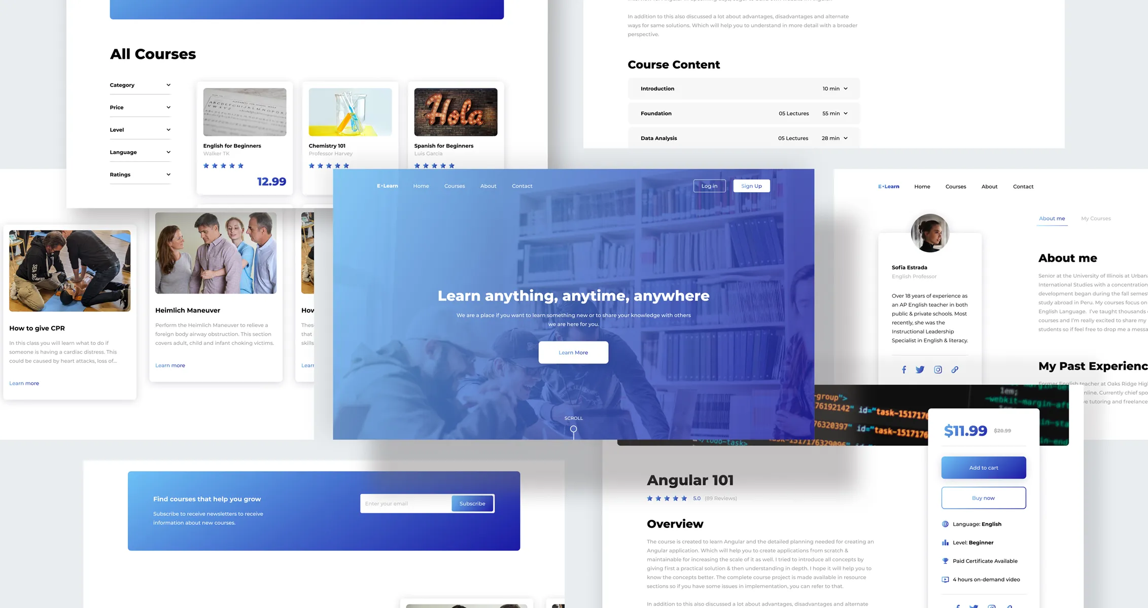
Online Learning
A new way to learn at your own pace. E-learn is striving to give future students a place to learn at their own discretion and also to give future professors a platform where they can share their knowledge and experience with others.
Paulo R. (Lead Developer)
Adrian H. (Front-end Developer)
Mirna J. (Back-end Developer)
Web
Paulo R. (Lead Developer)
Adrian H. (Front-end Developer)
Mirna J. (Back-end Developer)
Web

Understand
Creating a user-friendly and modern website for a client requiring a platform for students to learn at their own pace from any subject and tools for potential professors wanting to teach on the platform. As this is a new project with no previous designs I was given the green light in-order to provide a concept that would be ideal.

Problem Statement. After speaking with stakeholders and CEO about what was required and understanding the targeted users for this project. There is already a potential as some current professors currently make videos on certain medias for their students, but need a place to be able to give homework, follow progression, and upload material. Like wise for students and their needs of a personal portal, progression status of courses, and a place to learn new skillsets at their own pace.
Users, eager to learn, need a online learning platform because currently there is none making difficult to meet up with their professors.
Research &
Analyze
Starting out my process I started a competitive analysis in order to bring insights into new features, user-flow, and possible solutions. E-learn has many competitors and this helped me to see the strengths to found upon and weaknesses that could be improved in this new product.

User Data
Meeting key individuals and professors who had gather a small following of students through various medias and through them I was to meet some of their students. Overall, all professors had a gathering of 20,000 students and from there I was able to do user interviews and user surveys to be able to understand the target users and what were the needs that needed to be met on around 10-15 individuals. Once collecting all the data I organize the responses into themes to be able to reach a consensus.
From the data I collected I was able to ideate possible solutions and also lead me to starting my initial concepts.

Ideation
Creating a information architecture assisted in the organization and structure of the app. This help me see what screens are actually needed, what was being repetitive, and what would be the optimal work flow for the user. Also adding new features and tools so users may be able to achieve what they need to on their own.
From the data I collected I was able to ideate possible solutions and also lead me to starting my initial concepts.

Wireframes & Usability Testing
Once having all the data I commenced sketching low-fidelity wireframes to explore and view potential workflows, simplifying certain screens, and ease-of-use for the users. From there I moved to start mid-fidelity wireframes to start founding workflows and viewing user-flows.
From there I also created a prototype to be able to conduct usability testing with unmoderated and moderated tests. Once the tests were completed I was able to receive valuable information which I brought back to reiterate certain screens.


Design
Once finalizing and moving from mid to high-fidelity wireframes I moved to the Ui design. Founded on feedback from potential users and also optimized screens to feel easy to use while aesthetically appealing. I used the brand colors, provided by the CEO, to match the identity of the company, modernized design, and layout to appeal to a wide audience. Once I tackled these tasks I organized and peered review with the dev team to clarify question or concerns, regarding functions for certain sections.


Launch
Project was presented to client, feedback was provided and changes were made, but overall they were ecstatic with the look and feel as it was close to what they had envision. Foreseeing about the possibility of doing a dark mode, in the future, for when students study late at night so they won’t have a blaring white screen for those late night sessions. We delivered the project to their development team and we were explained that they would like to start in Latin-America with an estimate of 20,000 users and from there, based on feedback, open up enrollment in the U.S..

